Monday, September 30, 2013

Process Poster Shots

So I am a little further in the process, a few steps away from being finished. I did these over the weekend but completely forgot to post them!

1. Cubism


2. Natural


** I am still playing with the fonts, but I will get more feedback on that at crit tomorrow! 


Thursday, September 26, 2013

AJMF - Refined concept

I have refined my cubism concept, I am just very lost when is comes to the type. I am not sure if I want to make it part of the design (cubic) or if it should be a type face and have a more legible quality instead of a design quality.

I will probably get a fresh perspective tomorrow after some rest!

Here are two examples so far. I want to make a series. Once I figure out the type, the posters will just flow and I can make one for each instrument! :)


Tuesday, September 24, 2013

One Step Closer: AJMF

I am moving closer to my final designs, but there are still a few hurdles I need to cross.


I think for the cubism posters, instead of having multiple instruments, I should just create one big instrument with a lot of values. That way I can create a whole series later, also it might look a little less busy. The is so much information still missing and the composition is already full of so much movement and visual information.


There is still a lot to be done with this design. I am going to add bottom corner designs made of the wood design I have on the top, and I need to redraw the stones at the bottom spelling out "Jewish Music Festival"/ The 'saxophone' I had in mind to be ling on the right of the stone design, I think I will replace with the AJMF logo. finally, I still need to add the date, and 'Atlanta'.


Saturday, September 21, 2013

AJMF Progress

After much more research and sketching I have finalized my two concepts... which are actually the two I started with.

1. Cubism
Picasso inspired, very beautiful and there are some fantastic cubism-compositions containing music. It seemed only fitting.. plus Picasso was Jewish, that always helps a little as well :) I recently heard someone say, "I like the idea of discovering something that is already there". I loved this. It is such a joy to look at something over and over again and still finding something new every time. I think cubism the perfect example for this,


2. Fallen Stones
For this I wanted to take a different approach. More hand drawn, more personal. When I think of it, I think of the Jerusalem wall. I actually have a piece of it in my room, I had the honor of receiving it as a gift a few years back. From this little piece, I thought of all the little pieces that have fallen, but are still very valuable to the 'bigger picture'. That is where this concept was born and hopefully will grow. I am hoping that once I put it in the computer, it will look just as cool!


Sunday, September 15, 2013

AJMF: Atlanta Jewish Music Festival

My BFA class has the opportunity to work the Jewish Music Festival this year. GSU's design class has been participating and it's pretty exciting that we are keeping it going.

Our Mission: Design a promotional poster or a memorabilia if you will.

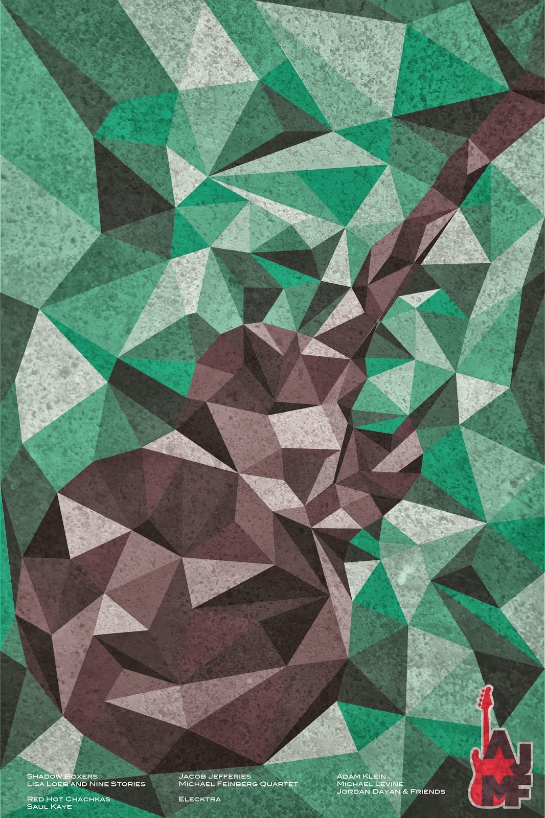
Guidelines: This poster will be silk screened so with this, so it has a limit of about 4 colors.

Other Guidelines: *Must have
1. AJMF Logo
2. 5th Annual
3. AJMF spelled out somewhere
4. Type heavy
5. Illustration
6. Date
7. Artists

They also have a new website coming out with a new color scheme, so we are told to stick to green and use the different tones/shades of that green for the majority of the poster. Also they have had some many iconic characters so we are told to stay away from those. 

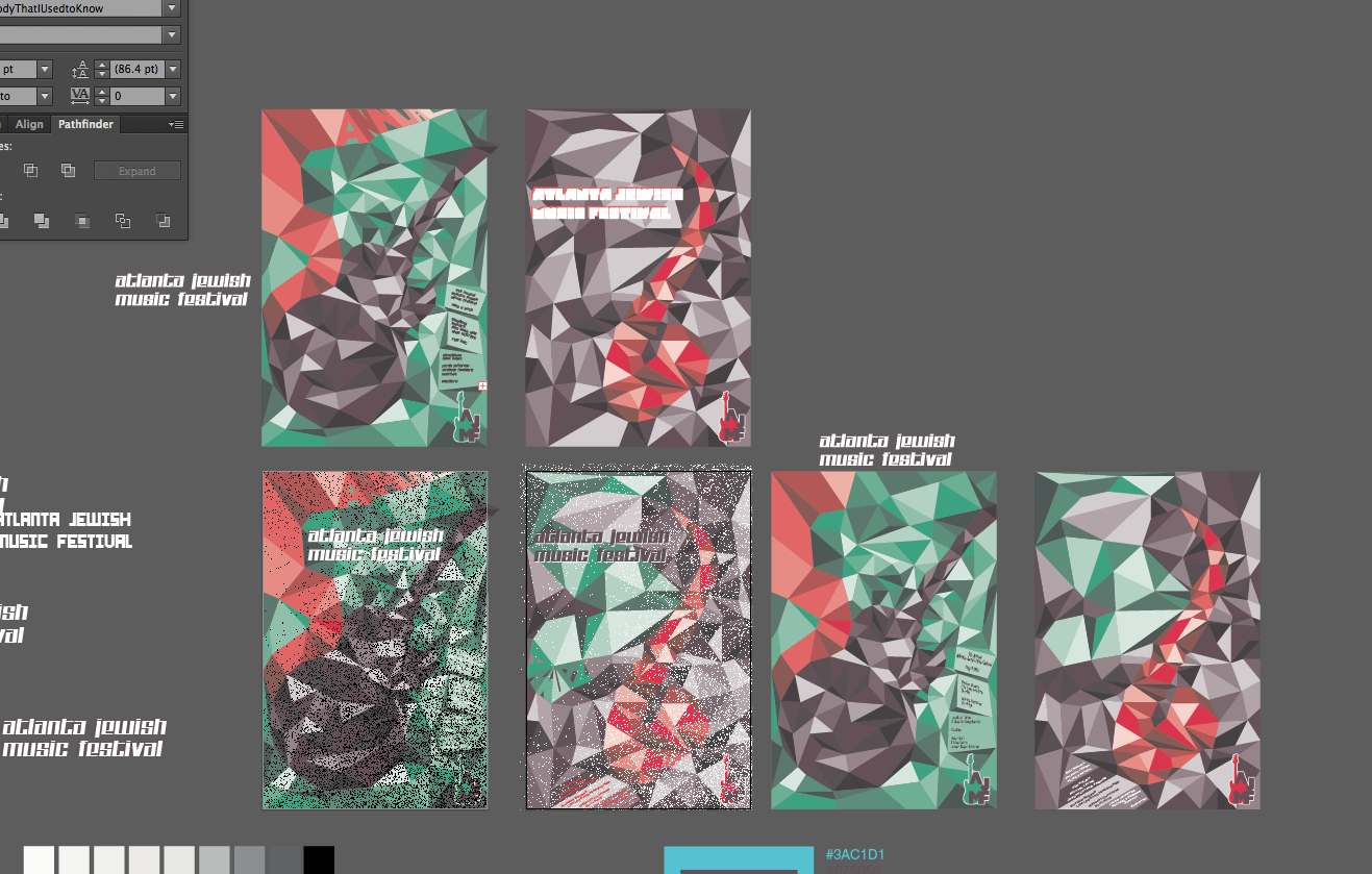
So here are some progress sketches...  


 I liked the idea of all the blocks, but the hierarchy should stay with Jewish not Atlanta, I still am not sure if this will do as a poster for a music festival...


Here I just kept exploring the idea of cubism and  combining all the different musical instruments and culture you find at a festival into one idea.

Thursday, September 5, 2013

Best and Worst Ads

What makes a good ad? What is the limit?


Good:

1. Action Climate Name Change
This ad is VERY influential. I get chills every time I see it.

2.OMO Detergent
Johannesburg, South Africa

3. Hair Removal
4.Body Building - Gym (Print Ad)
5. If you don't move, you get fat (Print Ad)

6. Adidas
Very cool.


 Bad:

1. Car engine? Maybe? I am not sure...

2. Reebok Fitness - Haha
3. Seven-Up
Looks like he is being force-fed!
4.Dettol Soap 
Really?
5.Dulcolax
Very funny, but a little inappropriate. It does get the point across however. 
6. Beer Belly

...