Saturday, March 31, 2012

Acoustix Ads

Hey guys, so I have been working on the Ads for a bit. 
Here is some images to show progress, but not the final product. I am going to vary the images a little, and maybe even do a little more with them, adding a filter and some minor edits isn't gonna cut it. I also want to make the 11X3 vertical. 


This was just to show the layout. The images need a little bit of tweaking, and then I will work more on the fonts. 


(also when I transferred these to web-safe images, some of the colors got lost... so just imagine this with more vibrancy!)


-Stick around for the final product!


Thursday, March 29, 2012

Earth Day Posters

So here are some ideas and follow ups of Earth Day posters. I am kind of excited about these! :)


Set One: "Notes are to a Symphony; as Trees are to the Earth"


Set Two: "Music Under the Trees, the Way Mother Nature Intended".
---This will actually be for an event. I will ad information about an outside concert in celebration of Earth Day. There will be some perks like no cover fee (Money=Paper; Paper=Trees) :P 


Final Stationary

Final Images of the Stationary has not been posted, but will be here well before the advertisements are finished! 


:)

Sunday, March 25, 2012

Earth Day Ads: Progress

So I had so many Ideas for posters for Earth Day. 
I currently have two concepts for the earth day posters. Also my restaurant is having their One Year Anniversary March 22nd, so I am also doing a promotional poster for that. :)


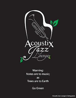
Concept One: Earth Day Logo
In order to make the logo even more recognizable, dressing it up for the holiday is perfect! It gives the word out about the current festivities while promoting the logo and the business itself!


Then to add the slogan and the information needed. (Still working on better slogans).


I need to work on making the colors transitional from one add to the other so that the ads look like they are meant to work in threes. 

Concept Two: Illustration

This I wasted to keep working on the contour of the instruments and focus on the music that will be played on Earth Day. 


Again I need to work on the colors. Also I do not know yet If I want to keep it as silhouettes or if I want to do it like I did the trumpet in my Logo. :?

Anniversary Concept:

My vision was to make it a concentrated photo image in the middle (with a spotlight) of a martini glass with a number one candle in the middle of it, and design all the text around it. I have the images, I just need to choose the ones I want and throw them into photoshop to FINISH! :)


Wednesday, March 21, 2012

Submitted to the 2012 Juried Student Art Exhibit!

Here are the works I submitted to the Juried Exhibit! :)

Fly: 18'' x 24''


Mexico Cruise: Photography


Typography Journal:
This is a two part book series with over 410 pages of different typography, rules, and facts. It is designed in stages. Birth, Growing Up, Awkward Stages, Teenage Years, etc. It ends with inspired design and a design statement. In the journal you read about the difference between good and bad design along with the DO's and DON'Ts. 


Tuesday, March 13, 2012

Typography Designs


Posted: 11 Mar 2012 11:40 AM PDT
Typography is the art and technique of arranging type, type design, and modifying type glyphs. It's performed by typographers, typesetters, graphic designers, art directors, comic book artists and graffiti artists. Typography is everywhere, including greeting cards, books, posters, newspapers, magazines, and any other print media. Typography goals are very simple. It must clearly communicate the message and do so in a visually effective way.
In this post we present you the latest findings from the wonderful world of typography design. We hope this collection will serve as a great resource for your typography inspiration. All the following works were hand-picked based on quality, and every image is linked to their original source. We do not take credit for any of the work mentioned below, however we do take credit for hunting the Internet!

Typography Design Inspiration

This roundup of typography is packed with incredible designs, high quality work, and skillful artists. Enjoy!
typography design inspiration 001 in Typography Design Inspiration   #1
typography design inspiration 002 in Typography Design Inspiration   #1
typography design inspiration 003 in Typography Design Inspiration   #1
typography design inspiration 004 in Typography Design Inspiration   #1
typography design inspiration 005 in Typography Design Inspiration   #1
typography design inspiration 006 in Typography Design Inspiration   #1
typography design inspiration 007 in Typography Design Inspiration   #1
typography design inspiration 008 in Typography Design Inspiration   #1
typography design inspiration 009 in Typography Design Inspiration   #1
typography design inspiration 010 in Typography Design Inspiration   #1
" - Boost Inspiration.com :)

Monday, March 12, 2012

Stationary Update (Reasoning for all the Black)


Reworked the stationary, I unfortunately wasn't there for the critique today in class, but I hopefully made up for it by staring at it at home while class was in session. I adjusted the anchor line next to the text in the first image with the business cards, it includes the logo more. Then I moved all the text a little to the left, to give leave more room for text. I also adjusted where the address goes on the envelope. I will have a mock up of that on wednesday, a long with a real business card and all of it mounted. :) 

What do you all think?!


I know having it be all black isn't ideal, but it really flows with the actual restaurant. Everything is dark, but in a good way, once you enter the restaurant. Even the outside is painted black. I have some great ideas to incorporate some fun things in with this color scheme, and having the logo be all black leaves no limits on color for advertisements and promotional events.