
Rethink Canada designed this Mr. Lube gift and business card that demonstrates what the service is all about. Getting rid of that annoying "change oil" sign.

Agency Bos from Toronto created a business card for Head2Head that served a dual purpose. Not only does it provide a functional benefit (given that each card contained 5 perforated filters), but it also adds a stickiness factor because the card would be something you'd hold onto and refer to, as frequently as you smoked.

The Paint & Cia's Paint Card reads: "We bring back your car's original paint job."

Choko la's candy wrapper business card

Bart Turkey created this card for a fitness trainer. It demonstrates what the trainer does best. Slims clients down.

A business card that is, indeed, a tiny envelope. With this was tied the message: NO DELIVERY TOO SMALL.

Renato França Personal Trainer's Define your weight business card.

The Credit Counselling Society is a registered non-profit service based in Vancouver and their card looks like a credit card cut in half.

Dilly Dally is a toy store built on ‘inspiring play’ and igniting the imagination of children. Each component of their brand identity incorporated a sense of play, interaction and endless exploration.

Going to a store and taking a business card is customary. Now, what you can do with it is what varies. Tok&Stok turned their business card in a entertainment. To allude to their easy to assemble furniture, the brand launched an unprecedented action that converts the business card in a little chair. To do so is very simple: just detach the parts marked and put them together. The back of the card has the logo, while the seat takes the essential information such as address and phone number.
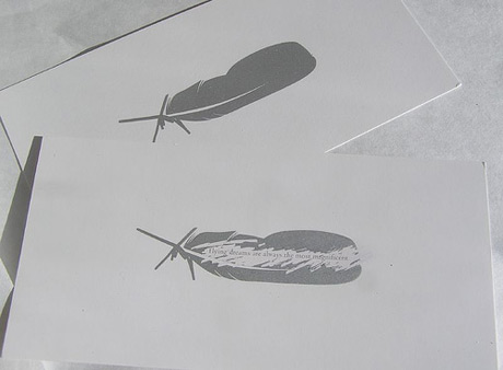
Make your business partner work for your contact details. Let them scratch.
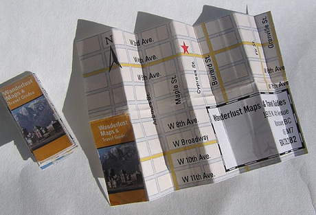
Let them find you easier. Make a mini map.
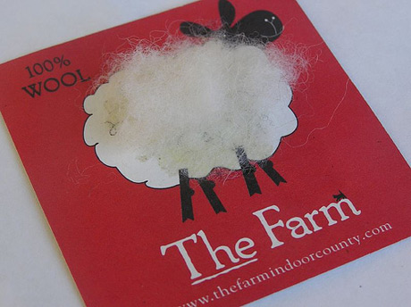
Decorate your card with a bit of fluff.
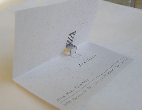
Cute fold out. Brings back old childhood memories.
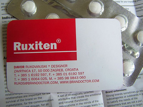
Make it look like the product you're selling.
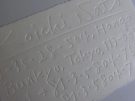
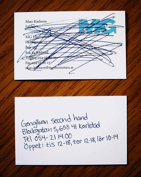
Ooops. It's an impression from my notes.
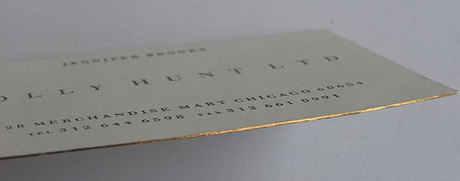
Add a bit of class and expense. Have gilded edges.
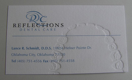
Add teeth impressions if you're a dentist. Thumb prints for a detective. You get the drift.
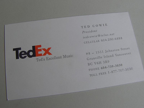
Spoof a famous logo.
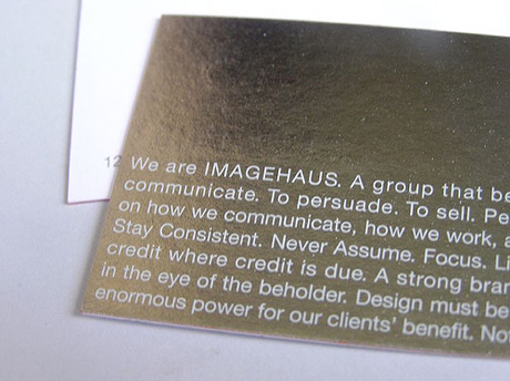
Use shiny metal surface.
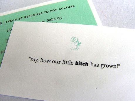
Write fun copy.
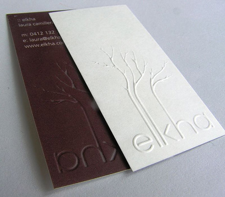
Pay extra for stylish embossing.
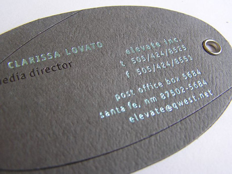
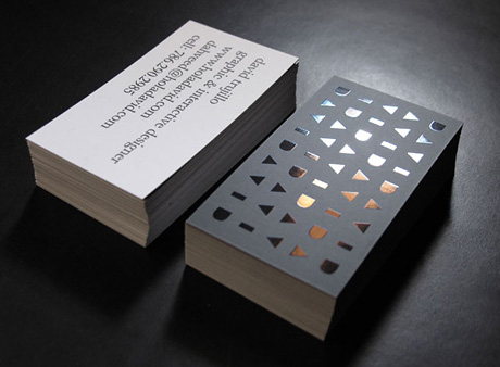
Use metallic ink and a metallic hole.
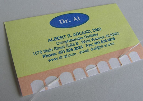
Teeth floss? Gross!
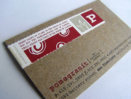
Combine different papers.
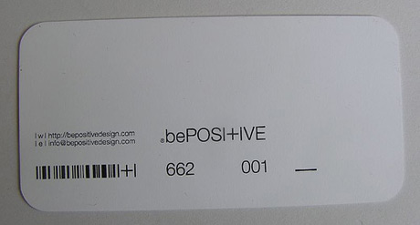
Stay minimal and positive.
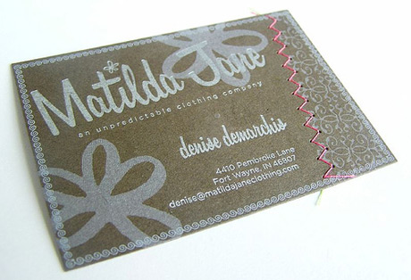
Use a thread.
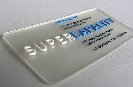
Make an 3D plastic card.
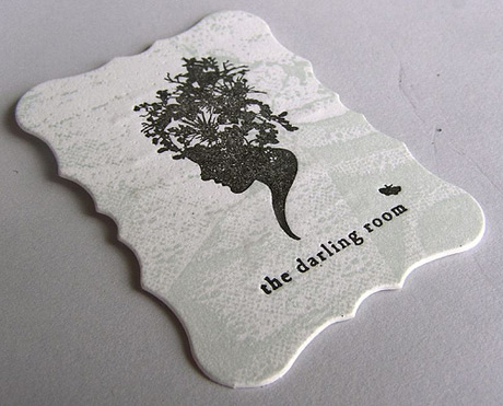
Come up with a fun die-cut.
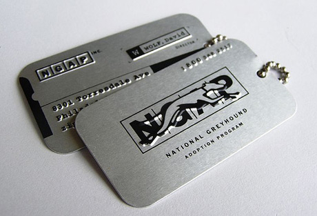
Dog tag theme.
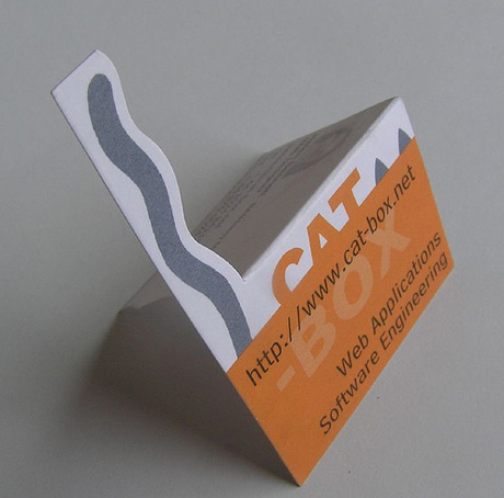
Cat tail theme.
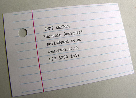
Use office scrap.
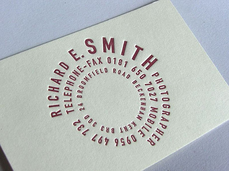
Use fun typography.
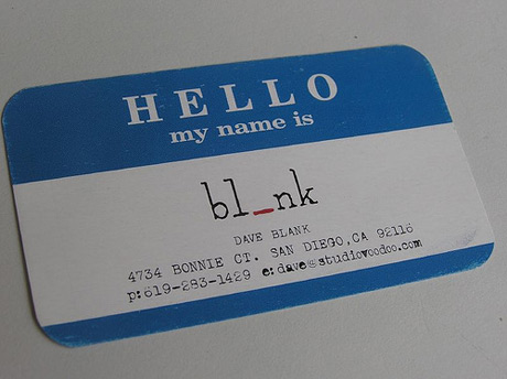
Blind date theme.
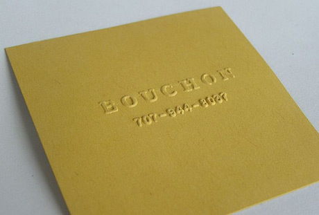
Simply square with no ink.
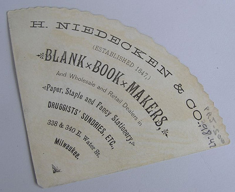
Funky shape.
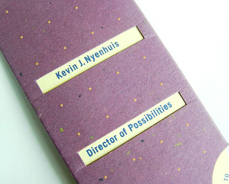
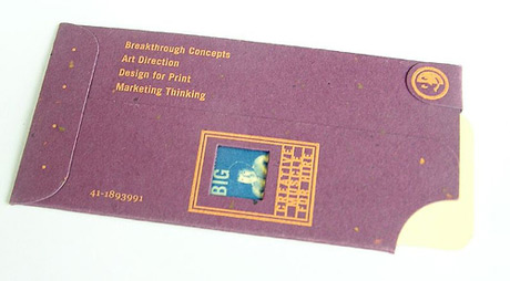
Interchangeable insert in a generic cover.
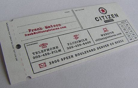
Free one way ticket to the moon.
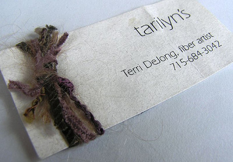
Demonstrate your skill.
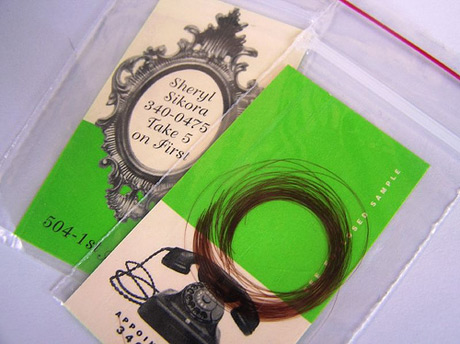
Forensic evidence?
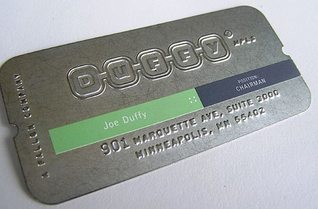
Metal card. Doubles as a cake cutter.
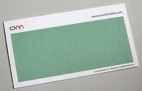
Is this scratch and sniff or just generous use of white space.
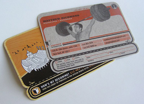
Try the retro look.
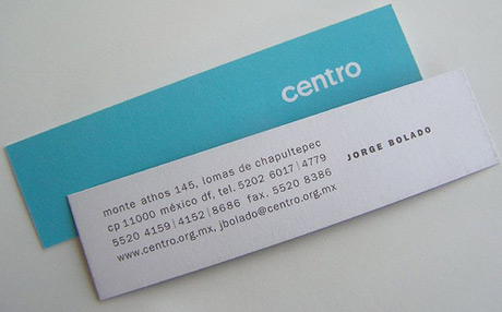
Elegantly long and thin. Reminds me of a card I designed for a perfume shop that looked like a scent tester.
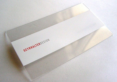
Transparent thin.
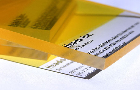
Transparent thick.
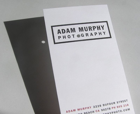
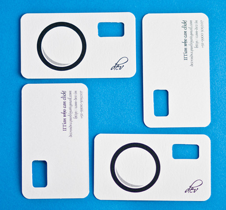
Camera obscura. In case the Nikon breaks it comes handy to get the job done.
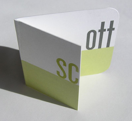
Folded and playful.
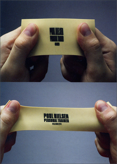
Expandable rubber to test your strength. One more time. And, one more. One last time. Good job. Now, what was the number again?

Reuse old cards for a second hand shop.
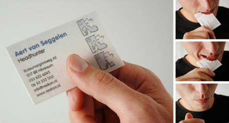
Get rid of the evidence you ever met the headhunter.
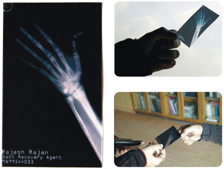
A clear message from a debt recovery agent. If you don't pay I'll break your bones. Here's the x-ray of my last client broken finger as proof.
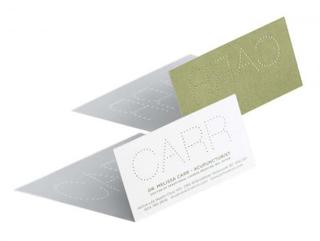
Business card for an acupuncturist with small holes to demonstrate what will happen to your skin.
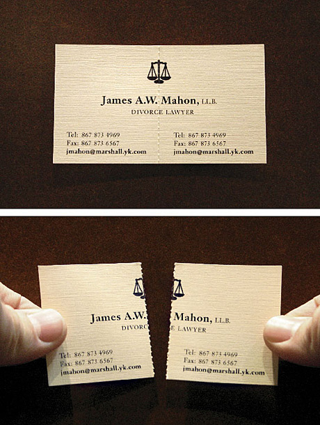
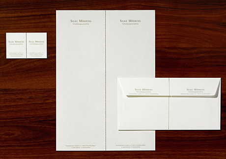
Perforated cards demonstrate what a separation lawyers does.
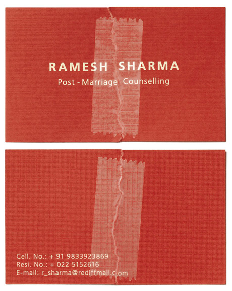
If you don't want to separate you can consider marriage counseling with a help of scotch tape.
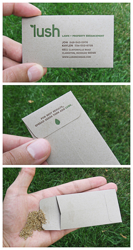
There is nothing better then a little freebie. In this case a few seeds demonstrating how lush can make your place greener.
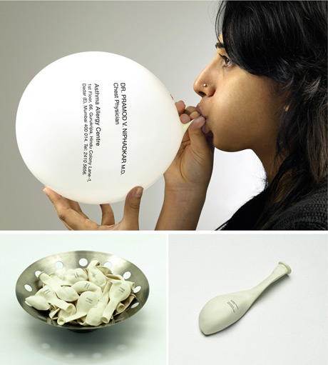
A balloon visiting card for a chest physician that is only legible when inflated demonstrates how important it is to have healthy lungs.
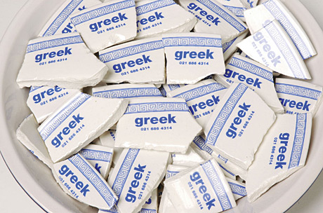
Pieces of broken pottery are used to hold the name and phone number for a greek restaurant.

A set of semi-transparent layers allows you to mix and match clothes on the illustrated girl. (Click the image for a larger size.)
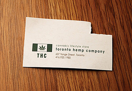
Finally, allow me not to explain the meaning of this card for the Toronto hemp company. The target will know exactly what it means.
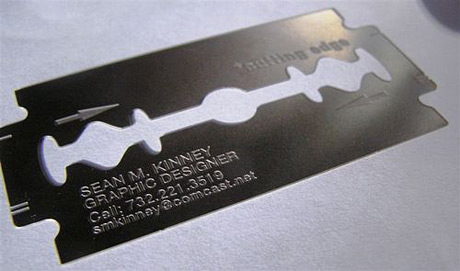
Let's start with a cutting edge design. Literally.
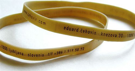
And if you managed to cut too deep use this rubber band to stop arterial bleeding.
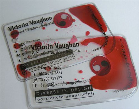
Which brings me to this bloody cool design. You can play with this forever.
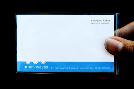
When you're done playing, look at this concept where the card is in a small plastic bag to protect it from getting wet. Naturally this is done for a swimming instructor. Cheap and great.
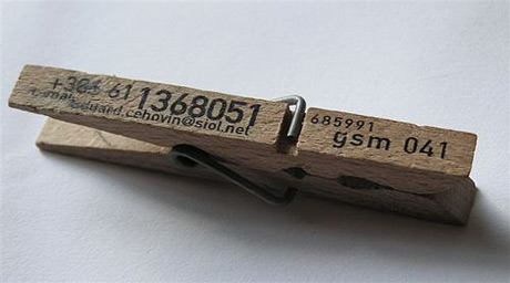
You can make use of other inexpensive household objects as well to grab the attention and make sure you won't fit into the standard business card holder. Like this clothes pin "card".
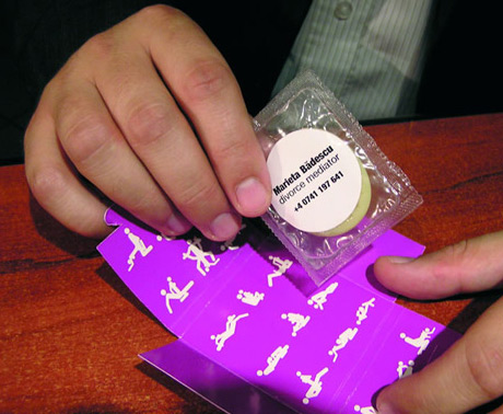
Ideally you would need to be relevant to the subject of your profession with your idea. Like this condom pack that is used by a divorce lawyer as his visiting card as well as distributed in bars as a direct marketing piece.
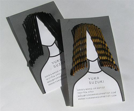
Or this hair grip holder for a hair and make-up artist.
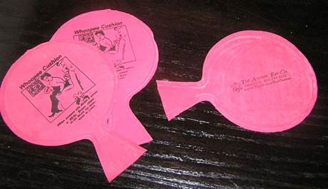
And if you really want to be remembered, give a whoopee cushion. It's certainly great fun on one hand, or I should rather say one cheek. Personally, I wouldn't want my persona to be associated with loud farts.
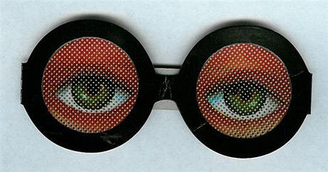
How about these silly glasses? While it will make my 2 year old laugh for sure, good luck with them on the board meeting.
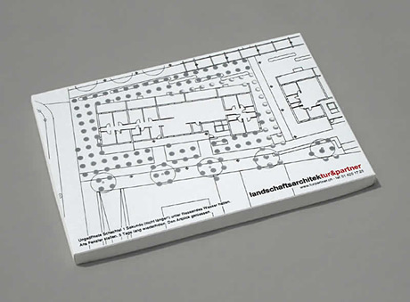
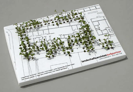
You can stop cracking jokes and still remain playful by designing a card that germinates and demonstrates your abilities to create a great park in no time, as it is done for this landscaper architect.
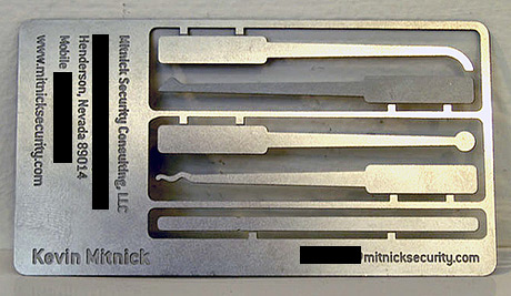
Another card that demonstrates a profession is the card of Kevin Mitnick, the famous hacker, which is essentially a lock picking tool set. He always said that the easiest way to get hold of a password is to ask the blond secretary for it in an authoritative tone, so I have no idea why he needs to break in anywhere.
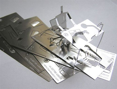
Another metallic card. This one is in the shape of a mini designer working hard at his desk.
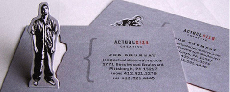
One more mini person at your service any time you wish to pull him out of your pocket.
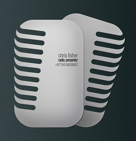
Let's look at more cards that refer to professions. Here is a card that resembles a Larry King microphone for a DJ.
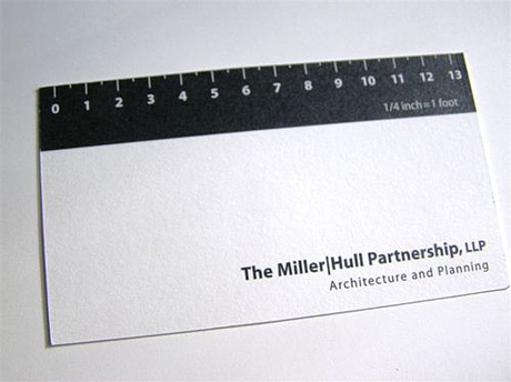
Another done for an architect that features a ruler. Don't expect a Hundertwasser style building from this guy!
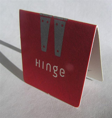
Great idea for a simple product. Demonstrate what hinges do directly with your card.
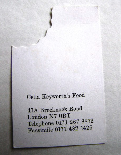
Yes, it's been done too many times, but it still works. A card for a restaurant with a bite. I wonder if I should put ketchup or mustard on my card before eating it. I think I'll put both.
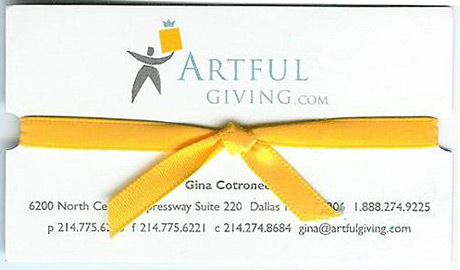
A card for a gift shop with a ribbon and a bow of course. How sweet!
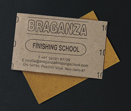
This sandpaper based card is made for a finishing school in India. What the hell do they teach at a finishing school? I wonder what came first. The client or the idea?
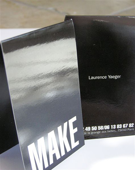
Talking about special paper, here is a card made of really shiny paper. Nothing modest about this one. Miss Hilton would love it.
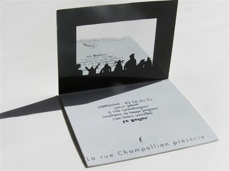
More folding shiny goodness for a puppeteer.
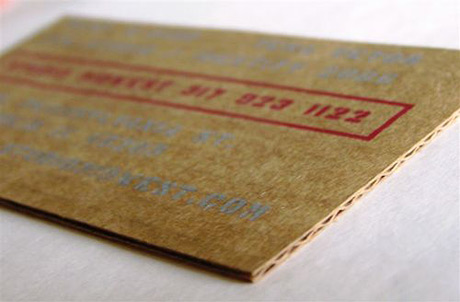
If you can't think of an idea, you can still use a special material for your card and it will still make you stand out from the crowd. Like this one made of fine corrugated cardboard.
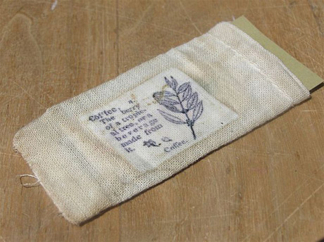
This card also uses special material, but in this case it's totally relevant. It's printed on rough textile that is similar to the material of the bags coffee comes in.
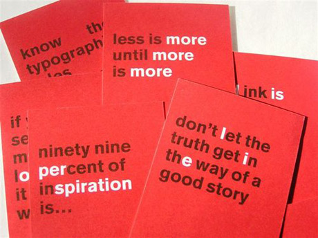
Traditionally cards are designed by graphic designers or art directors and copywriters are not part of the process. But you really should involve your writer next time. Check out this funny set of visiting cards.
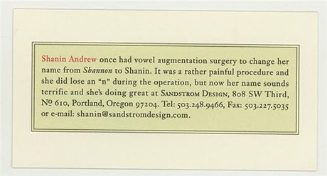
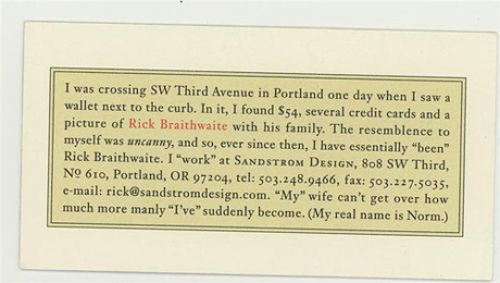
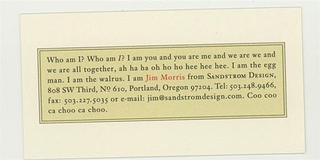
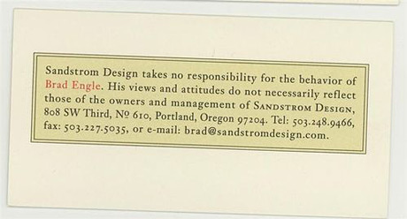
Another great copy based concept here.
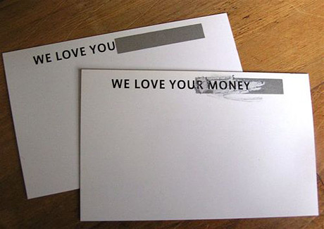
This simple copy based business card reminds me of my dad, who always said it pays to be honest. So, if you can't afford a talented copywriter, just be yourself and be brutally honest. I wonder what this guy's personal card says. I love you(r tits)?
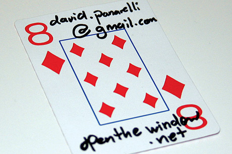
Talk about being broke. Don't print a card at all, just buy a pack of playing cards and write your contact info on it. You can also recycle train or parking tickets. Giving away ATM slips or used sanitary products are not recommended.
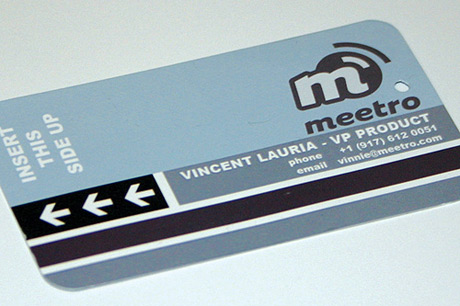
If you like the idea of tickets and have the budget to get it printed you can simply copy the design.

Or fake a pack of chewing gums. It will be most popular with the Singapore customs officers.
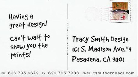
And while away send miniature postcard-like business cards to prospective clients.
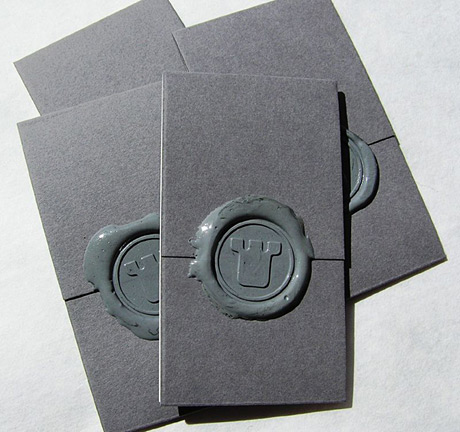
If you feel royal send cards that look like letters stamped with wax .
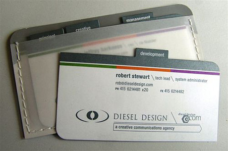
While you're at it, why don't you introduce the whole company at once. Give your client a whole portfolio of cards.
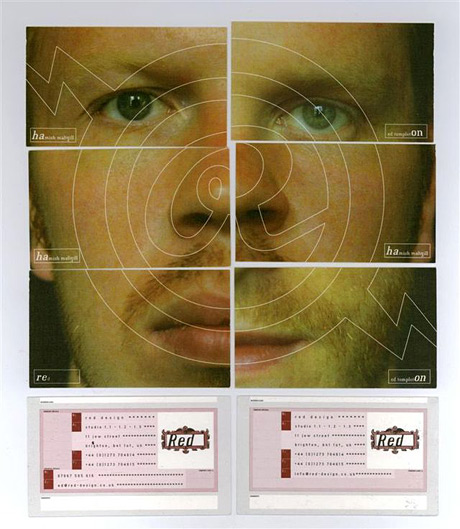
If you'd rather stay away from such a frankenface, simply create a series of cards with different designs on their backs and give a new one to your partner for every new assignment. Works great with clients with obsessive compulsive disorder.
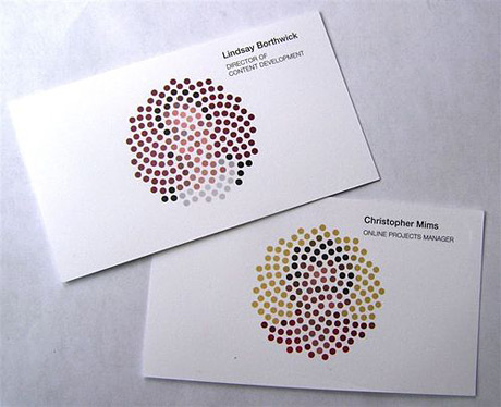
Your partner may not have OCD, but have you tested him for color blindness? You may try to do just that with this card that reveals the cardholder's face reproduced with an inkjet printer sporting a stunning 1dpi resolution.
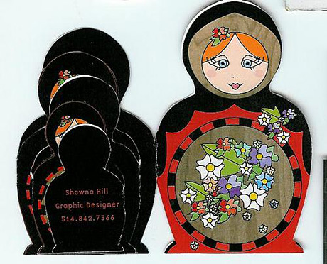
Be careful, a card says a lot about their owner. This clever folding matryoshka doll card for example suggests multiple personality disorder.
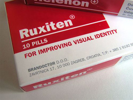
To cure these conditions, how about offering a pack of pills?
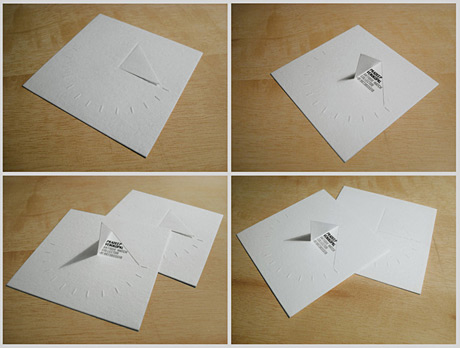
Going back to fun foldings, here is a card that can be turned into a sundial. It's been created for an antique watch collector.
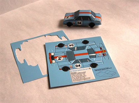
Another interesting folding will be liked by modelers. Fold a toy car and keep it on your desk.
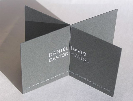
Please don't overdo these folds. Daniel who? Mr Castor what? This one simply confuses the hell out of me. Great way to intimidate your client into never calling you again.
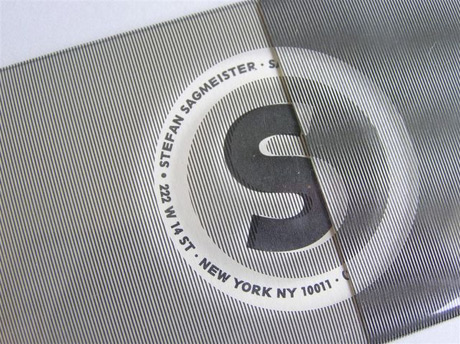
This one is stripy.
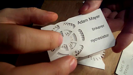
Here is a laser cut card. This idea really pushes the limits of what can be achieved with paper. Click to watch the video.
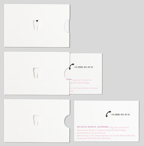
A bit more creativity and a little less die-cut can also demonstrate well what your client does. In this case the dentist removing cavities.
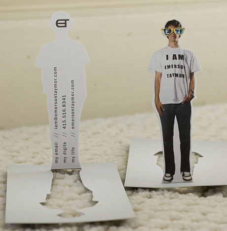
Makes sure to have an idea, don't just have a punch-out for no real reason.
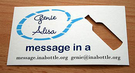
The message is very important if you're going to bear the extra cost of laser cutting or die-cutting.

You can make the holes big enough so you can put your fingers through to complete the picture, like on this card for Yoga classes.
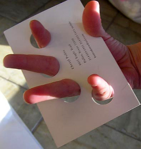
This card for a manicurist is a little oversized, but it may even prove to be useful.
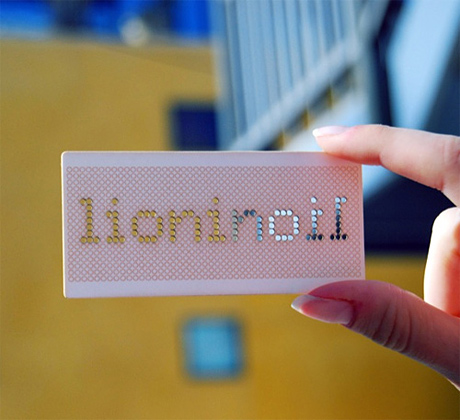
The thing with die-cuts is they show on the other side of the card, which is usually an annoyance, but if you're smart you can make good use of it, like on this card made for a company Lion in Oil. This card reads both ways.
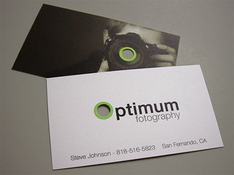
I know this idea has been done before for photographers, but still like this one because it makes a good use of the die-cut on both sides.
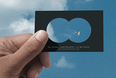
You really need some solid stock to make this card usable. There is more hole than paper on this one. The idea is great though. It's for an ornithologist (bird watcher) and the punch-out is in the shape of a binocular view.
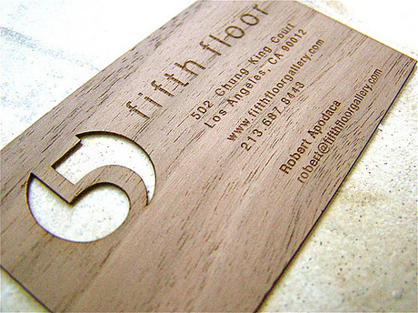
You can use other more expensive materials if paper doesn't hold well enough. This one for example is made up of thin wood board.
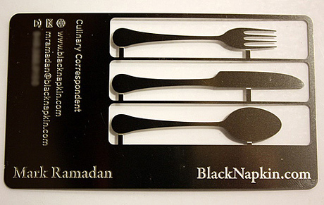
And if wood isn't enough for even more detail go for thin metal sheets.
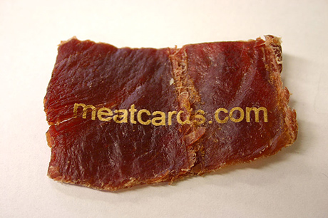
If you're still hungry after eating soup with that spoon, you can eat this beef jerky card. Perfect if you don't want people calling you after that all important meeting.
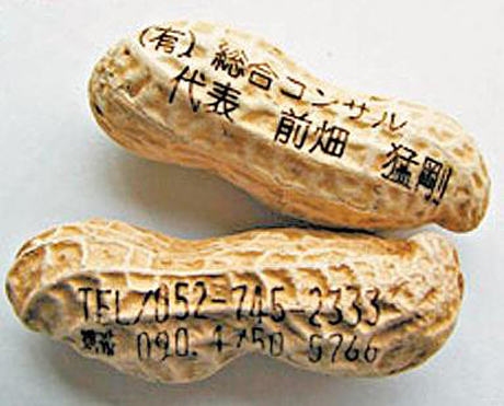
Nowadays, you can print any object with ink jet printers that shoot the ink drops through a distance of up to 10cm. Not just peanuts like on this example. You can even print the surface of water in a glass, which is of course not very portable, but still, the possibilities are endless.
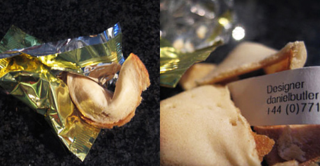
For dessert you can meet the guy with the fortune cookie business card. Have a bunch of people with such visiting card on your meeting and you can save on all the snacks. Just serve them water to wash all the cards down.
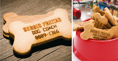
Don't let your dog stay hungry either. The owner of this business card is a dog trainer, who printed his info on tasty dog treats.
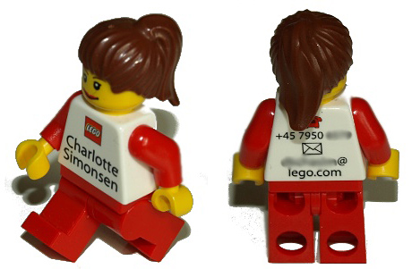
Toys, like these lego figures work just as well.
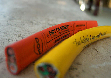
Pieces of electrical cords for a person working for the Department of Energy. "Here is my business cord sir! — No, there is nothing in my mouth."
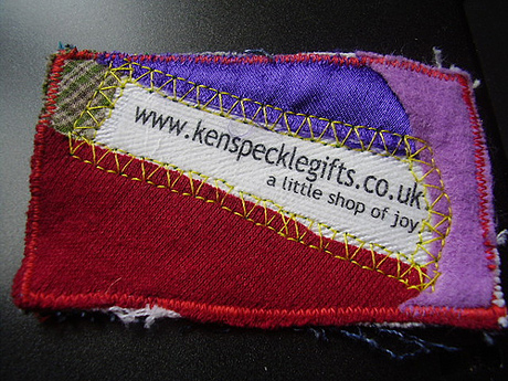
Patchwork business card for a gift shop to communicate that everything is hand made.
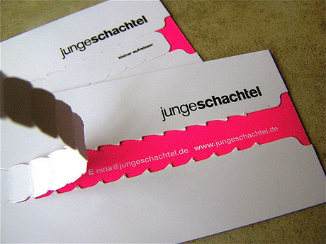
If confidentiality is your message use this card with a proof of use.
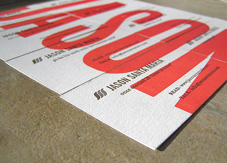
If teamwork is your selling point, use a set of cards for different team members that together make up one image.
Sometimes including a little game is what you need to make your card memorable.
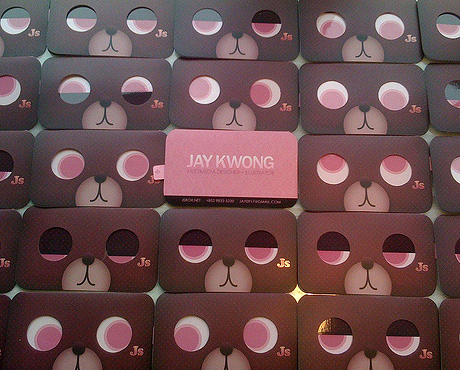
Animated layers for a multimedia artist.
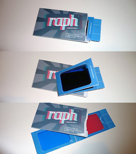
3D glasses for a 3D graphic designer.
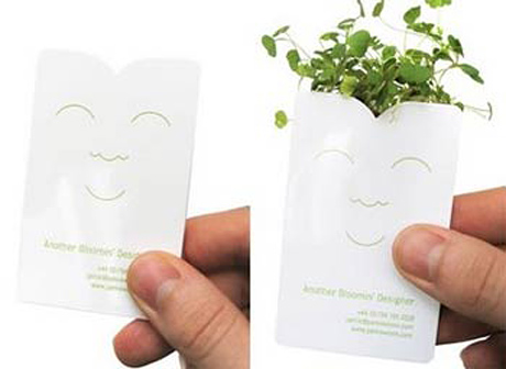
A card that grows little plants when placed into water made for a gardener.
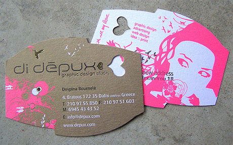
Other times refined designs with art paper, embossing, UV varnish or unusual typography is what's required for a good effect.
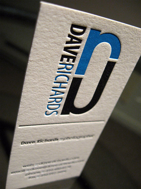
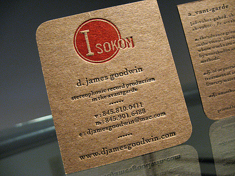
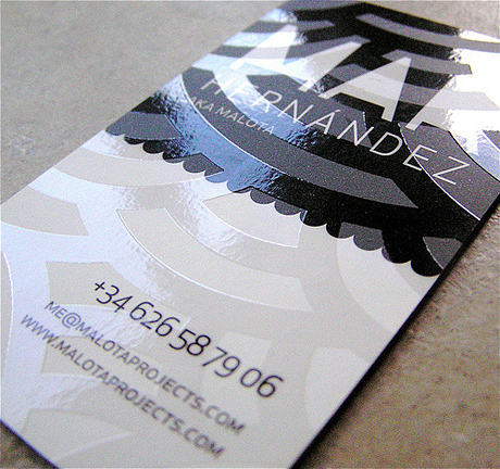
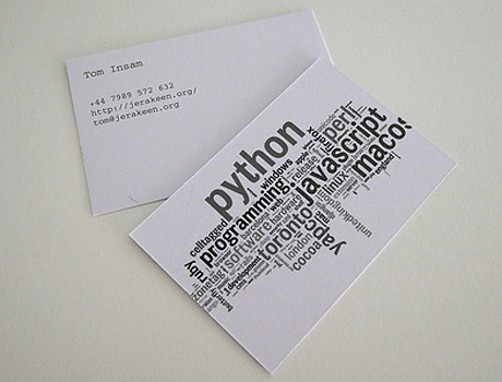


With all the new technology around us, do we still need to carry physical business cards around? Can't we just rely on people googling us? Well, it may work as long as you have a memorable set of keywords that surely resolve to your domain.
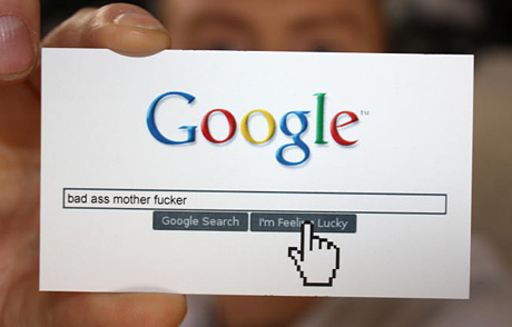
Maybe not like this one.

Maybe not like this one.
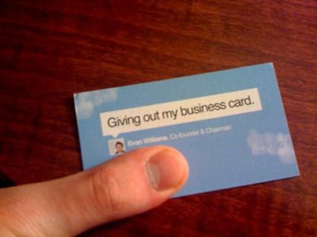
Prefer twitter? Make sure you twitter the event of giving a card out immediately.
I think there is a future for business cards. Cards with more and more technology.
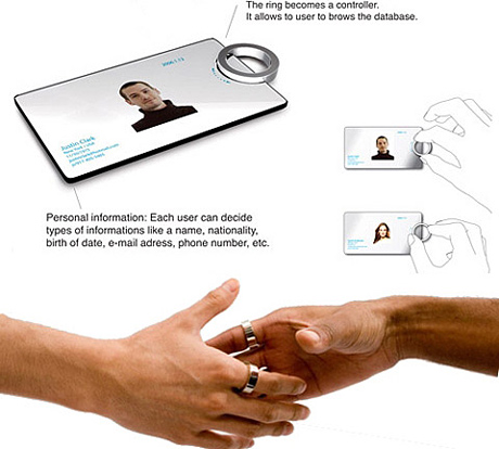
This concept card includes a ring with a proximity sensor and allows exchange of data when you shake hands with your new contact. This would give a whole new meaning to the handshake that now becomes obsolete among teens.
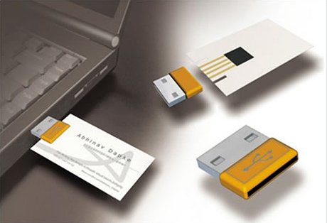
Another concept with a card that includes a magnetic strip, which simply plugs into a USB adapter which in turn syncs the new data with your Address book.
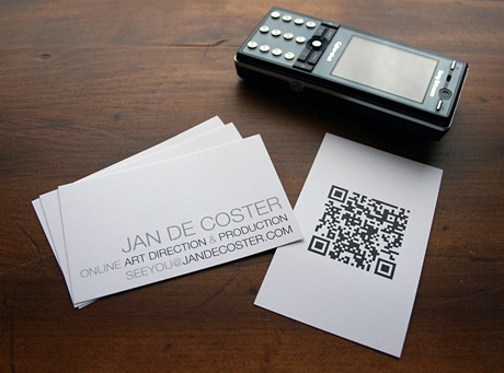
A cheaper solution is to include a mobile phone readable 2D barcode on your card that allows people to scan in your data quickly and precisely.
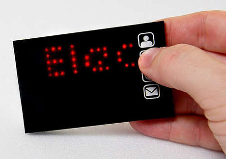
Finally a reprogrammable, highly expensive card that is great if your target is old people with poor eyesight. It let's people read the data in huge letters upon pressing the four buttons.
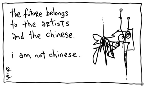
Hard to tell what the business card of the future will be, but we can take Mr Hugh MacLeod's advice who wrote on the back of a business card, as he usually does: "The future belongs to the artists and the Chinese." So, if you're not Chinese you better become the best artist you can be. Hopefully, this post will inspire you to come up with a lot of cool new ideas that you will post for us to see here in the design critique section.
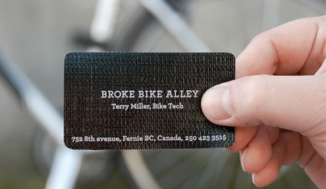
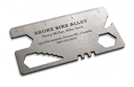
A cheaper and a more expensive solution for Broke Bike bicycle service from Rethink Canada. One is made of a flat tire patch the other one is a tool that fits in your wallet and lets you adjust your bolts and spokes. It opens your beer too.
Another card from Rethink for a financial consultant. One side says sell, the other buy.

Rather than a conventional business card to offer the makeup services to the customer, it was created a special stamp that simulates a lipstick mark. The stamp may be applied to any material, such as napkins, paper sheets, tissues etc.

Sweet Thrills is a candy store. Kenneth Montague is a dentist. MacLaren Canada thought it would be awesome if they shared a business card.

Transforming the traditional Business Card in the funny and unusual object, a little box of transporting cargo air. Designed by Y&R Brazil.

Here's a stationery package that was recently designed for a sandwich shop. The cards look like as if they were sliced salami.

Extreme Group from Toronto designed this card for Agrie Paint Services. You have to tear it up to read it.

Oversized business cards were delivered to ad agencies and design companies to promote PacBlue Printing's high quality large format printing capabilities.

These business cards were typeset on cloth and tied in a knot. Clients would loosen the knot to reveal the name and information of the massage therapist. Designed by Leo Burnett Canada.
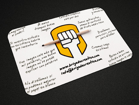
Brigada Creativa decided to play with their logo to create a nice and original card.
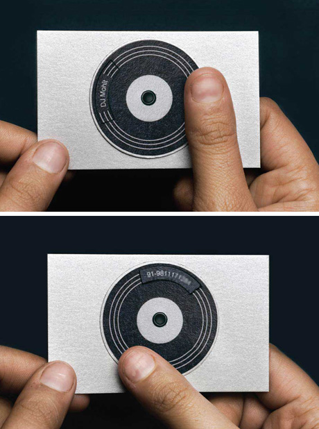
Interactive mini mixing table card for an Indian DJ designed by creatives Deepak Nagar and Nasheet Shadani.
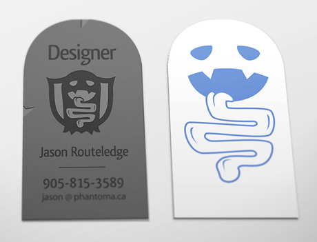
Card that looks like a tomb or a ghost.
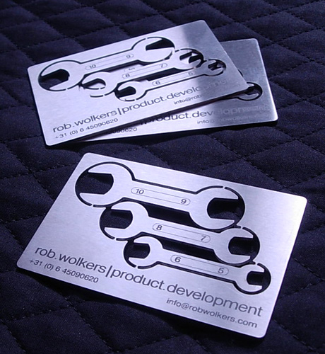
Laser cutted/laser engraved stainless steel card with three functional breakaway wrenches for Rob Wolkers product developer.
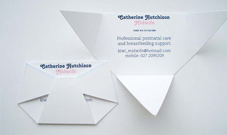
My Favorite: http://adsoftheworld.com/media/dm/tokstok_toy_chair_business_card





Stunning designs for plastic business cards, these captivating cards soft image of the company.....
ReplyDelete