Thursday, July 12, 2012

Beauty Around the World

It came to my attention that I have some viewers across the globe! Which is so awesome!!
I researched some of the places, and found some beautiful landmarks :)

This makes me ready to hop on a plane and explore!!


St. Sophia Cathedral, Ukraine

https://blogger.googleusercontent.com/img/b/R29vZ2xl/AVvXsEiQiFZbwzveO_19hndZoIBIXITfGpjeiaRkkluYZ1fJOER1Tlhr-_r3pIWpIUybxbARY9Uhyphenhyphen6h6y94ZN0lyyECupoUifelnGOeQrA8n46ejwSQg2TBkRVgeWC2YIX6Xn5g-YlxcidQjzcb8/s1600/Ukraine_002.jpg 


Chateau de Chenonceau, France
 
http://www.roxanneardary.com/wp-content/uploads/2007/10/Chateau-de-Chenonceau.jpg 

The Blue Mosque, Turkey

http://www.tiogaadventures.com/L41-SuleimanMosque.jpg 

Neuschwanstein Castle, Germany

http://www.baviere-quebec.org/imperia/md/quebec/tourismus/neuschwanstein_bild.jpeg

In Bangkok, Thailand

http://redeyefrog.files.wordpress.com/2007/08/tha01003.jpeg

The Kaleshwar Temple, India

http://www.landmarksfoundation.org/images_projects/images_kaleshwar/kaleshwar01.jpg

Uluru, Australia

http://blog.visafirst.com/wp-content/uploads/2012/07/5707724_high.jpg

Banaue Rice Terraces, Phillipines
 
http://4.bp.blogspot.com/_zfhPa9HEtgQ/TTLopWaIkqI/AAAAAAAAABM/QutXUB370tw/s1600/BANAUE-RICE-TERRACES-715556.jpg


:)

Awesome Navigation Design

Upon my search for Navigation Design Inspiration I stumbled upon this website... 


It has some unique and insightful navigation ideas, ranging from extremely simple to some beautiful web 2.0 feels!

Enjoy!

Friday, July 6, 2012

Another great Google Font Combination Helper!

Hola! Here again, and the last article like I promised! Great info... still haven't read this one either, but it's partner was good, so I know this one is also as knowledgeable as the last one! Enjoy!


10 Great Google Font Combinations You Can Copy

Written by , Published On 23rd October 2011.
Filed in CSS.
The average man considers which flavor of Doritos will taste good with his Heineken. The sophisticated man considers which cheese will pair well with his choice of wine. The designer of course considers which two fonts will look great on the same page.
Today we’re going to use the Google Font API as a playground for mixing fonts and finding ideal pairings. You’ll be able to skim through and instantly grab out selections that you think are appropriate for your projects. The best part? You need only to copy and paste our code to implement these fonts on your site. It’s completely free and there are no downloads required.

A couple of times each month, we re-publish one of our popular posts from the archives. This article was originally published in February, 2011, but is still just as useful today!

Why Google Fonts?

The web font game was up in the air a few years ago. Everyone had an idea and a solution but no one really knew which would be left standing when the dust settled. In my mind, this debate is over: @font-face won.
Here’s why @font-face wins. First, a pure CSS solution is one that developers can get on board with. Next, the fact that @font-face fully supports text selection and actions such as copy and paste means that usability experts love it. Finally, the fact that you can easily cook up an @font-face recipe for just about any font means that designers love it because they have a wide range of properly licensed fonts to choose from. If you get developers, designers and the usability guys on board, it’s game over for Flash, JavaScript and image-based solution.
Now, within the @font-face world there are many competitors. My personal favorite solution is just to use FontSquirrel’s @font-face kits, whether I’m downloading one of their pre-built options or uploading a font file so the site can churn out the rest for me.
However, I’ve used this solution several times on Design Shack before so I wanted to switch things up today and use something else. Since the Google Font Directory is free and has plenty of options, it seemed like a natural fit!
screenshot

Quick Tips for Combining Fonts

Before we get started, there are a few basic rules that you can keep in mind when combining fonts. These aren’t absolutes that you must follow in every occasion but merely some guidelines to stick to when in doubt.

Use Font Families

First of all, when possible, check out the various fonts within a single family. These fonts have meticulously been designed to work together and are therefore the safest method of varying your font without creating visual discord.

Contrast is King

Next, when you’re combining two fonts, go for contrast. Try pairing a bold slab with a light sans-serif. If you mix two fonts that are fairly similar, the lack of contrast makes it look more like something is slightly off with the typography rather than the intended impression of two different typefaces. Make it clear to designers and non-designers alike that two distinct styles are present.

Go Easy

Also, limit yourself to only a few typefaces. If you can get by with two, do it, if not, stop at three. In all but the most experienced hands, lots of different fonts wreak havoc on the cohesiveness of a design. It’s easy to end up looking like a kid who just discovered the font menu in Photoshop for the first time.

Think About Which Fonts Are Appropriate

Finally, let the content play a big role in your font choice. If your content is modern and professional, stick to fonts that suggest these qualities. If it’s supposed to look like something from the 1700s, Helvetica Neue Ultra Light might not be the best way to go.

The Fonts!

Enough discussion already, let’s get down to business. Cruise over to the Google Font Directory and look for the following options.
If you’ve never worked with the Google Font Directory before, don’t worry, it’s the easiest custom font solution out there. All you have to do is drop a link into your page header and then reference the font in your CSS font-family just like you would anything else. For each font pairing below I’ll provide you with all the necessary snippets of code so that all you have to do is copy and paste!

Lobster & Cabin

Lobster is one of my favorite scripts of all time. It’s bold and beautiful while remaining quite readable, attributes not easily found in other scripts.
To complement this strong statement, you don’t want anything that competes for attention. Instead pick something plain and simple like Cabin.

screenshot

The HTML
<link href='http://fonts.googleapis.com/css?family=Lobster' rel='stylesheet' type='text/css'>
<link href='http://fonts.googleapis.com/css?family=Cabin' rel='stylesheet' type='text/css'>

The CSS
h1 {
 font-family: 'Lobster', Georgia, Times, serif;
 font-size: 70px;
 line-height: 100px;
}
 
p {
 font-family: 'Cabin', Helvetica, Arial, sans-serif;
 font-size: 15px;
 line-height: 25px;
}

Raleway & Goudy Bookletter 1911

screenshot

Raleway is a super attractive font, but it’s so thin that it doesn’t always work the best on body copy. For this reason, it’s best to keep it as large as possible whenever you can, which makes it a perfect font for your headers.
I think the combination of Raleway and the fairly ornate old stye Goudy Bookletter 1911 make for a super classy pair. Be careful though, this particular Goudy is a little too complex for tons of body copy and I definitely wouldn’t want to read a big page full of copy written in it. This combination is probably best for scenarios with minimal copy.

The HTML
<link href='http://fonts.googleapis.com/css?family=Goudy+Bookletter+1911' rel='stylesheet' type='text/css'>
<link href='http://fonts.googleapis.com/css?family=Raleway:100' rel='stylesheet' type='text/css'>

The CSS
h1 {
 font-family: 'Raleway', Helvetica, Arial, sans-serif;
 font-size: 50px;
 line-height: 70px;
}
 
p {
 font-family: 'Goudy Bookletter 1911', Georgia, Times, serif;
 font-size: 15px;
 line-height: 25px;
}

Allerta & Crimson Text

screenshot

Allerta is a moderately bold sans-serif with a personality. If you don’t want something boring or something crazy, it’s a good middle ground that looks great in both a headline and body copy.
Crimson Text is a straightforward font with strong serifs but little to no differentiation between the thicks and thins. This makes is retain a good amount of readability even when its small.

The HTML
<link href='http://fonts.googleapis.com/css?family=Crimson+Text' rel='stylesheet' type='text/css'>
<link href='http://fonts.googleapis.com/css?family=Allerta' rel='stylesheet' type='text/css'>

The CSS
h1 {
 font-family: 'Allerta', Helvetica, Arial, sans-serif;
 font-size: 50px;
 line-height: 55px;
}
 
p {
 font-family: 'Crimson Text', Georgia, Times, serif;
 font-size: 16px;
 line-height: 25px;
}

Arvo & PT Sans

screenshot

No font selection would be complete without a good slab serif. The Google Font Directory only has a couple of these and Arvo is currently one of the boldest options. I really like most of the characters but admit that the “S” feels a little awkward.
Over The Edge
I paired this with yet another great sans-serif: PT Sans. There are several variants of this available but the plain version is the best for body copy. I really like how round the characters are, it makes for a very friendly feel.

The HTML
<link href='http://fonts.googleapis.com/css?family=Arvo' rel='stylesheet' type='text/css'>
<link href='http://fonts.googleapis.com/css?family=PT+Sans' rel='stylesheet' type='text/css'>

The CSS
h1 {
 font-family: 'Arvo', Georgia, Times, serif;
 font-size: 59px;
 line-height: 70px;
}
 
p {
 font-family: 'PT Sans', Helvetica, Arial, sans-serif;
 font-size: 16px;
 line-height: 25px;
}

Dancing Script & Josefin Sans

screenshot

Scripts are hard to implement properly, especially when they’re not as widely applicable as Lobster. Dancing Script, shown in the example above, definitely isn’t my favorite script but it’s one of the better ones available in the Google Font Directory.
Since Dancing Script is a lot more feminine than Lobster, I paired it with Joesfin, a really thin sans-serif to further this style. This combination is definitely appropriate for any products or websites with a female skew.

The HTML
<link href='http://fonts.googleapis.com/css?family=Dancing+Script' rel='stylesheet' type='text/css'>
<link href='http://fonts.googleapis.com/css?family=Josefin+Sans' rel='stylesheet' type='text/css'>

The CSS
h1 {
 font-family: 'Dancing Script', Georgia, Times, serif;
 font-size: 59px;
 line-height: 60px;
}
 
p {
 font-family: 'Josefin Sans', Helvetica, Arial, sans-serif;
 font-size: 18px;
 line-height: 25px;
 margin-top: 15px;
}

Allan & Cardo

screenshot

I typically hate comic-type fonts, but Allan is really eye-catching and attractive. I love the boldness of the font and the italicized feel.
My pairing with an old style font (Cardo) seems almost a conflict of time periods but I really liked the way they looked together. Feel free to opt instead for a light sans-serif.

The HTML
<link href='http://fonts.googleapis.com/css?family=Allan:bold' rel='stylesheet' type='text/css'>
<link href='http://fonts.googleapis.com/css?family=Cardo' rel='stylesheet' type='text/css'>

The CSS
h1 {
 font-family: 'Allan', Helvetica, Arial, sans-serif;
 font-size: 70px;
 line-height: 75px;
}
 
p {
 font-family: 'Cardo', Georgia, Times, serif;
 font-size: 18px;
 line-height: 25px;
}

Molengo & Lekton

screenshot

Molengo and Lekton together feel like an old school attempt at a technical feel. Largely due to the typewriter feel of the latter of these.
This combination is something I would expect to see on a website with a parchment texture background along with photos with a polaroid effect and maybe even some coffee stains.

The HTML
<link href='http://fonts.googleapis.com/css?family=Lekton' rel='stylesheet' type='text/css'>
<link href='http://fonts.googleapis.com/css?family=Molengo' rel='stylesheet' type='text/css'>

The CSS
h1 {
 font-family: 'Molengo', Georgia, Times, serif;
 font-size: 56px;
 line-height: 80px;
}
 
p {
 font-family: 'Lekton', Helvetica, Arial, sans-serif;
 font-size: 16px;
 line-height: 25px;
}

Droid Serif & Droid Sans

screenshot

One of our tips above suggested staying within a single family. I put this into practice here with the natural combination of Droid Serif and Droid Sans.
As you can see, both are beautiful typefaces that perfectly complement each other. These could easily be switched so that Droid Serif was the body font and Droid Sans the header font. You can spot Droid in the wild on a certain wildly popular design blog.

The HTML
<link href='http://fonts.googleapis.com/css?family=Droid+Serif' rel='stylesheet' type='text/css'>
<link href='http://fonts.googleapis.com/css?family=Droid+Sans' rel='stylesheet' type='text/css'>

The CSS
h1 {
 font-family: 'Droid Serif', Georgia, Times, serif;
 font-size: 49px;
 line-height: 65px;
}
 
p {
 font-family: 'Droid Sans', Helvetica, Arial, sans-serif;
 font-size: 14px;
 line-height: 25px;
}

Corbin & Nobile

screenshot

If you’re a fan of Cooper Black, Corbin is an excellent free alternative. This fat and toony serif is perfect for anything that should have a 1920s feel to it.
Nobile is a more modern font with letter forms that appear vertically stretched. The minimal styling here keeps your focus on the bold headlines. 

The HTML
<link href='http://fonts.googleapis.com/css?family=Corben:bold' rel='stylesheet' type='text/css'>
<link href='http://fonts.googleapis.com/css?family=Nobile' rel='stylesheet' type='text/css'>
The CSS

h1 {
 font-family: 'Corben', Georgia, Times, serif;
 font-size: 40px;
 line-height: 55px;
}
 
p {
 font-family: 'Nobile', Helvetica, Arial, sans-serif;
 font-size: 13px;
 line-height: 25px;
}

Ubuntu & Vollkorn

screenshot

Ubuntu is a notably rounded sans that has a modern feel to it. I used the bold variant here to give extra contrast from the body text.
Vollkorn is definitely a very different typeface, mirroring a long past era. Again, always be careful about mixing fonts from different time periods. Make sure it’s intentional and with purpose!

The HTML
<link href='http://fonts.googleapis.com/css?family=Ubuntu:bold' rel='stylesheet' type='text/css'>
<link href='http://fonts.googleapis.com/css?family=Vollkorn' rel='stylesheet' type='text/css'>
The CSS
h1 {
 font-family: 'Ubuntu', Helvetica, Arial, sans-serif;
 font-size: 50px;
 line-height: 65px;
}
 
p {
 font-family: 'Vollkorn', Georgia, Times, serif;
 font-size: 16px;
 line-height: 25px;
}


http://designshack.net/articles/css/10-great-google-font-combinations-you-can-copy/

The 10 Best Fronts from Google Fonts!

The 10 best fonts from the
Google Webfonts Directory


The idea of the Google Webfonts Directory is great: offering everyone free webfonts, which you can include in your website with just one line of code and without worrying about the multiple webfont formats, subsetting, file size, download speed and so on. When the service started in 2010 it offered just a couple of fonts. Today the catalogue has already grown to 250 fonts and Google announced there will even be a lot more fonts in the near future. But let’s face it: Most of the fonts are crap! They are of poor quality, derived from commercial fonts or just downright ugly. But there are also a few very fine fonts among them. Here is my list of recommendations. They all come with a small live demo or a link to a page using these fonts.

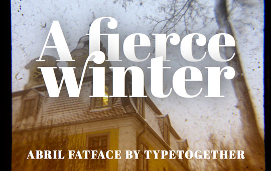
Abril Fatface

Type Together is currently my most favorite type foundry. They offer fresh and unique designs of high quality and their fonts usually have a great language support. Type Together were also one of the first type foundries which supported the idea of webfont services. (See my interview with Type Together’s Veronika Burian from 2009)
In the Google Webfonts Directory you can use their display font Abril Fatface. It is part of a bigger (commercial) type family system, with 18 Display and Text styles. The Fatface in particular is inspired by heavy titling fonts used in advertising posters in the 19th century Britain and France. The thin serifs and clean curves lend the typeface a refined touch and give any headline an elegant appearance. The character set that supports over 50 languages including those from Central and Northern Europe.

Live Demo View at Google

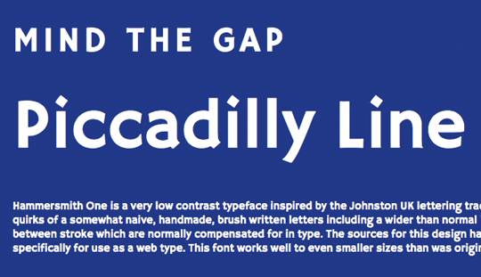
Hammersmith One

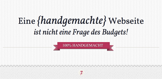
Hammersmith One by Nicole Fally is a very low contrast typeface inspired by the Johnston UK lettering tradition. Hammersmith One shows the quirks of a somewhat naive, handmade, brush written letters including a wider than normal “e” and “s” as well as dark joins between stroke which are normally compensated for in type. The sources for this design have been adapted not just for type but specifically for use as a web type. This font works well to even smaller sizes than was originally expected.

Live Demo View at Google

Droid Sans, Droid Sans Mono & Droid Serif

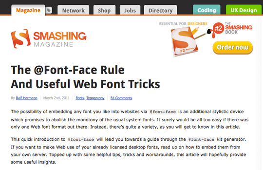
A lot of free fonts just come as single styles suitable for display use, but if you are looking for a good replacement for over-used system font families like Arial, Verdana and Georgia, the Droid fonts might be perfect for you. This font family was originally created by Ascender Corporation for use on the Android platform. As a live demo you can check out Smashing Magazine where Droid Sans regular and bold are used for headlines. The serif comes in four styles and there is also a monospaced version available. All of them can be used via Google Webfonts.

Live Demo View sans View serif View sans mono

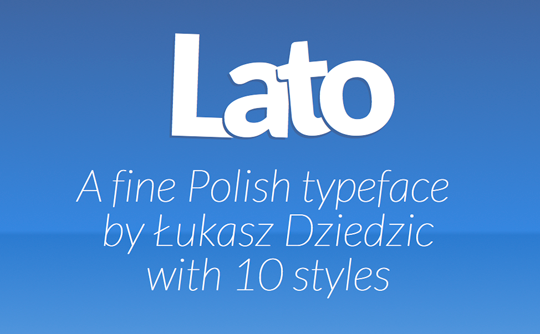
Lato

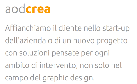
Polish type designer  Łukasz Dziedzic has brought us great commercial typefaces such as FF Clan. The Lato family was originally conceived as a set of corporate fonts for a large client, but since this client later decided to go in different stylistic direction, this nice type family became Open Source. While the roman styles have a rather neutral appearance, the italics look great in larger sizes and with 10 styles (including hairline fonts) you have a great typographic variety when using this type family for websites.

Live Demo View at Google

Vollkorn

This font family by German type designer Friedrich Althausen can be used as a quiet workhorse or as a catchy display typeface. While the regular and italic styles are beautiful and elegant, the strong serifs in the bold styles really draw attention to the text. The webfonts of this family were manually hinted for best screen rendering, even in small sizes.

Live Demo View at Google

Ubuntu

Even before its release this typeface has created some discussion because some designers found it too similar to the commercial typeface DTL Prokyon. As the name suggests, the font family is made for the Ubuntu operating system and over time should include all the languages used by the various Ubuntu users around the world. So the Ubuntu Font Family project will be extended to cover many more written languages. It comes in 8 styles and works great for headlines, but as this demo shows it can also be used for smaller text sizes.
Live Demo View at Google

Playfair Display

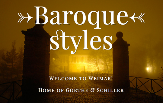
From the time of enlightenment in the late 18th century, the broad nib quills were replaced by pointed steel pens. This influenced typographical letterforms to become increasingly detached from the written ones. Developments in printing technology, ink and paper making, made it possible to print letterforms of high contrast and delicate hairlines. Playfair Display by Claus Eggers Sørensen lends itself to this period, and while it is not a revival of any particular design, it takes influence from the designs of printer and typeface designer John Baskerville, the punchcutter William Martin’s typeface for the ‘Boydell Shakspeare’ (sic) edition, and from the ‘Scotch Roman’ designs that followed thereafter. As the name indicates, Playfair Display is well suited for titling and headlines. Being a transitional design, stylistically Playfair can accompany Georgia, where Georgia is used for body text.

Live Demo View at Google

UnifrakturMaguntia

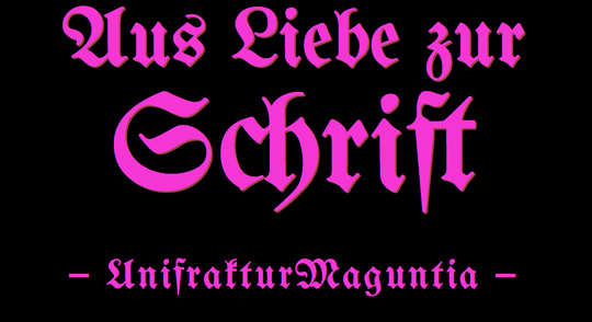
UnifrakturMaguntia is based on Berthold’s Mainzer Fraktur which is in turn based on a 1901 typeface by Carl Albert Fahrenwaldt. UnifrakturMaguntia uses smart font technologies for displaying the font’s ligatures (OpenType, Apple Advanced Typography and SIL Graphite). An experimental feature is the distinction of good blackletter typography between required ligatures ‹ch, ck, ſt, tz› that must be kept when letterspacing is increased, and regular ligatures (for instance, ‹fi, fl›) that are broken up when letterspacing is increased.

Live Demo View at Google

A Beginner's Guide to Pairing Fonts!

A Beginner’s Guide to Pairing Fonts

A Beginner’s Guide to Pairing Fonts


"Here is another site about font pairings, so far my favorite... its the ABCs to font pairing!" - Anri


Pairing fonts can be a challenge. Selecting two or more fonts which work well is one thing – selecting two which work together to achieve your typographic aims may have you reaching for the aspirin. Let’s see if we can alleviate any headaches. This guide will help you get started with font pairing for the web.

Luckily, typography has been around a lo-oong time. Typographic rules and conventions have had plenty of opportunity to establish themselves and there are loads of resources to help you out. The only problem is that by searching the internet you’re only going to find yourself confronted with millions of conflicting opinions! Let’s see if we can clarify a few things.
Here’s a quick breakdown of what we’ll cover in this guide:

Your Aim

Keep the essentials in mind. When you’re selecting multiple fonts to work together it’s crucial that you maintain both unity and variety.

How Many Fonts Should I Use?

How many fonts you throw into the mix is entirely up to you, but bear in mind the overall effect you’re trying to achieve. Fonts, like people, have personalities. And fonts’ personalities, just like those of people, can sometimes clash. Think of your fonts as table guests at a wedding reception; one entertainer is usually enough as too many strong personalities can make the atmosphere awkward, like an episode of Big Brother.
Make sure that there is some charisma in the group though; eight people with little to say just results in a toe-curling wait for the speeches..


It’s no longer around, but the Fusion Ads 2011 bundle site sicks in my mind as a great example of successful stack-em-high font use.
There are no rules to say you should or shouldn’t use a specific number of fonts on a page layout. Using multiple fonts together can be difficult, achieving harmony is challenging, but if you manage it the result can be decorative and striking. Use fewer fonts and your task is more straight forward. Try to make the best of both worlds by selecting fonts with multiple variants and weights. In this way you can take advantage of an array of styles, safe in the knowledge that they’ll compliment each other just fine.

To Buy or Not to Buy?

There are loads of free services through which you can take advantage of @font-face: google fonts, fonts.com, fontsquirrel’s font kit generator, but don’t immediately discount paying for fonts if the project warrants it. The cost of a single domain license can vary, but there are several advantages to shelling out.
Quality. The care and attention which goes into the production of commercial fonts is usually evident in the quality. That’s not to suggest the designers behind free fonts are caged monkeys, far from it, but there is often a qualitative difference. It’s a difference noticeable in the finer details; the line thicknesses, the forms, the white space and the kerning (spacing between characters).
Compare these two similar fonts..


The kerning executed with Museo is superior. Without some tinkering, the kerning in Quicksand is imperfect (focus on the ‘o’ and the ‘i’ for example), and tinkering with kerning on the web isn’t hugely intuitive. There are tools, kern.js for example, which allow you to specify kerning on a per-character basis, but large bodies of text make this impractical.
“Big deal, the difference is barely perceptible!” you may say, but the devil’s in the details. So my Nan tells me.
Originality. Another advantage is the opportunity to stand out with original work. Having paid for your fonts, there’s a greater chance your design will retain an element of uniqueness.
Community. Putting your hand in your pocket is also a way of encouraging the growth of the industry. Foundries rely on healthy commerce to continue their craft. In any case, we’re looking at a cost which can be factored into the project and passed on to the client.

What’s the Nature of my Content?

When selecting fonts it’s important to consider the nature of the layout you’re dealing with. Are we talking mainly body copy? Are there multiple headings, sub-headings? Perhaps it’s a magazine layout with decks, blockquotes? When using multiple fonts make sure that the roles are clearly established; if one font is used as a sub-heading, don’t switch to another font for a sub-heading elsewhere. Keep a font’s purpose clear.
For the time being, we’ll keep things straight forward and select a few font pairs. We’ll consider the circumstances under which they’ll work well together, and ask ourselves why.

How Do I Achieve Successful Pairing?

You might have already heard this; successful pairing relies on concord, or contrast, but not conflict. That is to say your selected fonts can work well together by sharing certain qualities, or by being completely different from one another. However, font pairs can conflict in a number of ways – being too similar being just one.
Let’s examine each of the successful possibilities.

Pairing 1: Concord

Describing two fonts as having concordance suggests the presence of the same trait in both of them. Perhaps their kerning is similar, their proportions, their cap height. Have a look at these examples from Kerry Scott Jenkins and you’ll notice clear proportional similarities.
One way of achieving concordance between fonts is to pair two from the same family. If they’re family, they’re bound to get on well, right?! In any case, the Droid family, designed by Steve Matteson for use on Google’s Android devices, comprises various weights and styles, with serif and sans-serif faces. Perhaps a bit un imaginative, but these two work very well together. One or the other takes charge of headings, the other the body text.


Either way round is a great combination. 


They’re clean and modern, plus (as you’d expect) they’re well suited for the web and smaller devices on account of their large x-height.
The x-height of a font describes the height from the base line to the upper reaches of the lower case characters, like the x. A proportionately large x-height helps with readability. And these two both share that quality.


Equally, fonts from the same designer often share qualities which help them achieve harmony. Look at the surprisingly similar proportions these two fonts display (check out the ‘o’)..


Pay attention to the line quality of two typefaces. They may at first appear to have nothing in common, but two crisply executed fonts may work better together than you’d think:


Softer lines together can be just as effective:


Pairing 2: Contrast

Contrast between fonts often lends a winning combination, but in what ways can fonts contrast? Here are just some qualities to look for:
  • Style: Take a look at any font resource site and you’ll see them categorized as Blackletter, Monospace, Script, Slab Serif etc. Fonts of different styles will often contrast.
  • Size: Big font, little font. Say no more.
  • Weight: Varying the weight of fonts is a common way to establish visual hierarchy. Hierarchy achieved by contrast.
  • Form: Consider the proportions of a typeface. The relative length of the descenders, the curvature of the shoulders, the direction of the movement.
  • Color: Not something we’re going to go into here, but color can easily determine whether two fonts work well together.
At its most simple, consider the contrast between serif and sans-serif fonts.
It’s a classic way of pairing; take a decorative serif for the heading and a sure-footed sans-serif for the body. Or take a no-nonsense sans-serif for the headings, with a pleasantly legible serif for the body. A winner in many cases. Let’s look at a few, kicking off with two system fonts. That’s right, even they can work well together.


Where can you see these two in action? Have a look at the skeleton boilerplate. Stripped of all superfluous styling, Georgia and Arial work perfectly in this environment.
For a little more refinement..


Don’t forget the role of whatever text you’re choosing fonts for. In the cases above, we’ve shown hierarchy through font-size; the headings are larger than the body text. There are other ways of establishing who’s the boss, weight being an obvious one.


Let’s say we’re not concerned with an entirely textual page layout. Perhaps we’re dealing with two headings and nothing more (an Under Construction message, for example). We can afford to be a little more adventurous as we don’t have to account for long measures or large bodies of text. How about a striking h1, coupled with a reinforcing h2?
Condensed fonts always work well to get your attention, as they take up a lot of vertical real estate.


Here’s an example of a similar combination working very nicely:


The distinctive work of Gerren Lamson and Simon Walker
And for those of you interested, here’s a breakdown of what those typefaces are:
And again, utterly contrasting qualities, yet a clear hierarchy through color which prevents either from stepping on the other’s toes..


Or how about two straight-playing sans-serif buddies? The next main heading (Conqueror) is an inline font designed expressly for titling. With it being an uppercase font, you might need to expand the letter-spacing a bit, as done in the example below.
Inline describes a typeface with white lines appearing inside the character strokes. – fonts.com
Sadly, it’s not available as a web font (yet) so you’ll have to make do with it for pixel design at the moment.. It’s definitely one of my favorite fonts at the moment.


Take this slab serif font; minimum effort, maximum impact.


Slab serifs make very effective attention grabbers, but can be a bit pushy if you’re not careful. Bull in a china shop sort of thing. The above example works actually very well with its more delicate partner, because it contrasts whilst also sharing some personality traits. They appear to be very different fonts, but if you examine the curves, you’ll see they’re not as dissimilar as you’d first think.

Some fonts are just so delicious that you almost can’t fail. Take Buttermilk for example; sumptuous, elaborate and decorative. It will look great whatever you pair it with (as long as you don’t try to steal its thunder!) Here we have pairing with Georgia:


And with Aller, an equally subtle sans-serif:


Then this was going to be my example of pairing it with a clashing personality – too strong in its own right. But you know what? I can live with this, it’s actually quite nice! I guess sometimes you can never tell..


Pairing 3: Conflict

Let’s not focus too much on what doesn’t work well, we don’t want to sour the joyous combinations in the rest of this guide do we? That said, let’s just illustrate how two fonts, which are arguably too similar, can look awkward together.


But why don’t they work well together? I thought the idea was to contrast whilst ensuring an element of unity?
They’re different styles; one’s a Blackletter, the other Roman serif, check.
They have different proportions; one’s condensed with a relatively large x-height, the other more extended with taller ascenders, check.
Yet they share weight and size, and both share those odd spurs on the end of each character.


Therein lies the problem. By sharing those last three details (weight, size and decoration) they’ve become too alike. They’re performing very similar roles, but the small differences are conflicting which makes for an awkward overall effect.
The curvatures of the spurs, for example, are completely at odds with one another:


Their axes are just ‘off’:


And the way a Blackletter’s formed gives it a slight direction, as opposed to the vertical nature of the Roman:.


These differences might not be a problem in other examples, but here we have two fonts which (at first glance) appear the same. It’s a bit like when you see a celebrity standing next to their waxwork model at Madame Toussauds. It’s never comfortable to look at.
It’s difficult to attribute ‘working’ or ‘not working’ to facts and figures, normally it will be a feeling you get, you’ll just know. Once you’ve concluded that you don’t like a font pairing, try to work out why and it will help you make decisions more quickly in the future.


Conclusion

I hope your approach to pairing fonts has been simplified by this beginners’ guide. If there’s one important rule you should take away from this it’s “You won’t know until you try!”
Be adventurous. As web designers we have an ever-growing repository of fonts available for use in our designs. Consider the fundamentals, then experiment. You’ll undoubtedly be surprised by what you find.